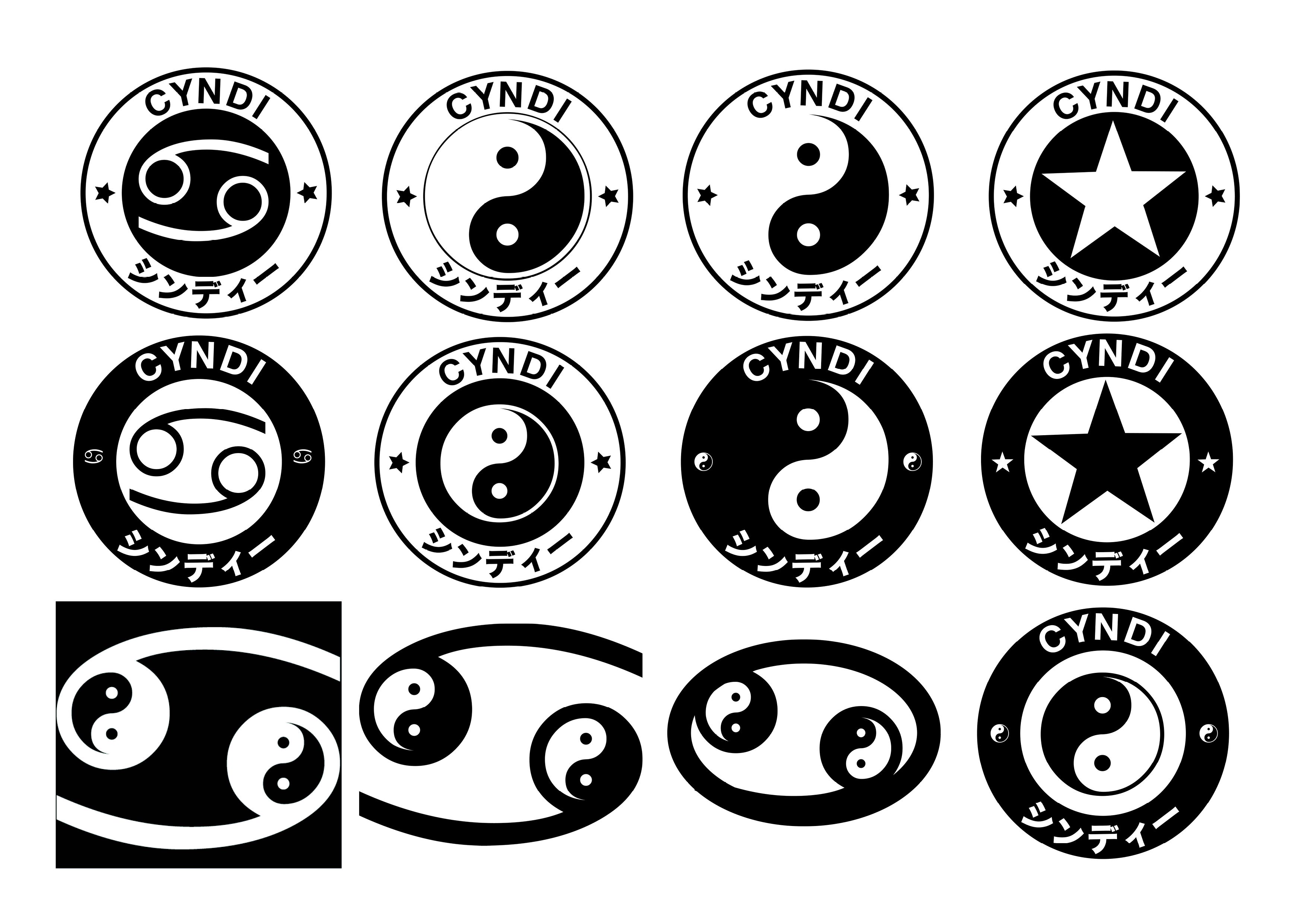
Every designer eventually has to answer the question of who they are visually. This is my answer, and it has a longer story behind it than a logo usually gets.
My first introduction to Japanese culture was One Piece, in the early two thousands. The adoration was immediate: the colourful characters, the storyboarding, the world-building, the willingness for adventure. From there I found manga and graphic novels, and I started understanding layout and composition not from a textbook but from the page structures of stories. The anime opening and closing themes introduced me to J-pop, and then to Visual Kei, and then to Japanese street fashion — a whole new world of what identity could look like. The way Japanese culture used clothing, colour, and silhouette to communicate something complete and deliberate about who a person was felt connected to everything I was absorbing about design. Fashion as visual language. Costume as character. Style as a system. That relationship between sound, feeling, and identity has lived in my work ever since.
My path to design was not straight. I studied product design, music, business, garment technology, printmaking, and textiles before arriving at visual communication. Each subject added a different strand. At college I worked with a Tjanting tool, wax, ink, and screen printing, learning that making something physical gives work a quality that digital methods cannot fully replace. When it came to designing my own mark, all of that history had to be in the room.
The starting point was a spider diagram: manga, prints, graphics, anime. I looked at the Cancer symbol, the peace sign, yin and yang. What I kept returning to was balance, the idea that you need both sides of something to make it work, that opposites in tension produce something more interesting than either alone. The final mark combines my star sign with yin and yang symbolism, held in a circular badge with Japanese typography.
What I was building toward was a mark in the tradition of the kamon: the Japanese family crest that holds a family's heritage, history, and values in a single geometric form. Something that could be hand-drawn on a notebook or set on a letterhead and still be completely itself. A mark that holds my own influences in the same way a kamon holds a family's history.