Placebo Effect is a self-initiated science fiction story I wrote and published online, chapter by chapter.
It is set in 2047. Everyone has been downloaded online. The earth had been decaying for years, land disappearing, the young dying faster, births and population increase falling behind. The world's solution was to leave it behind entirely. Governments incentivised reproduction, then surveilled it: fertility checks, DNA registries, biometric scans. Child abductions became so common it stopped making the news. A new uncomfortable normal settled in, and most people accepted it. They stopped asking why.
The main character never stopped asking. While everyone around him moves seamlessly through the domain, he is haunted by things that no longer exist: the feeling of real snow, wind against skin, the taste of something grown in actual soil, fruit that changes with the season. To him, the world everyone else has made peace with feels profoundly wrong. Not dangerous, not obviously broken, just deeply, quietly unnatural. His desire to disconnect is not rebellion. It is instinct. The story lives on.
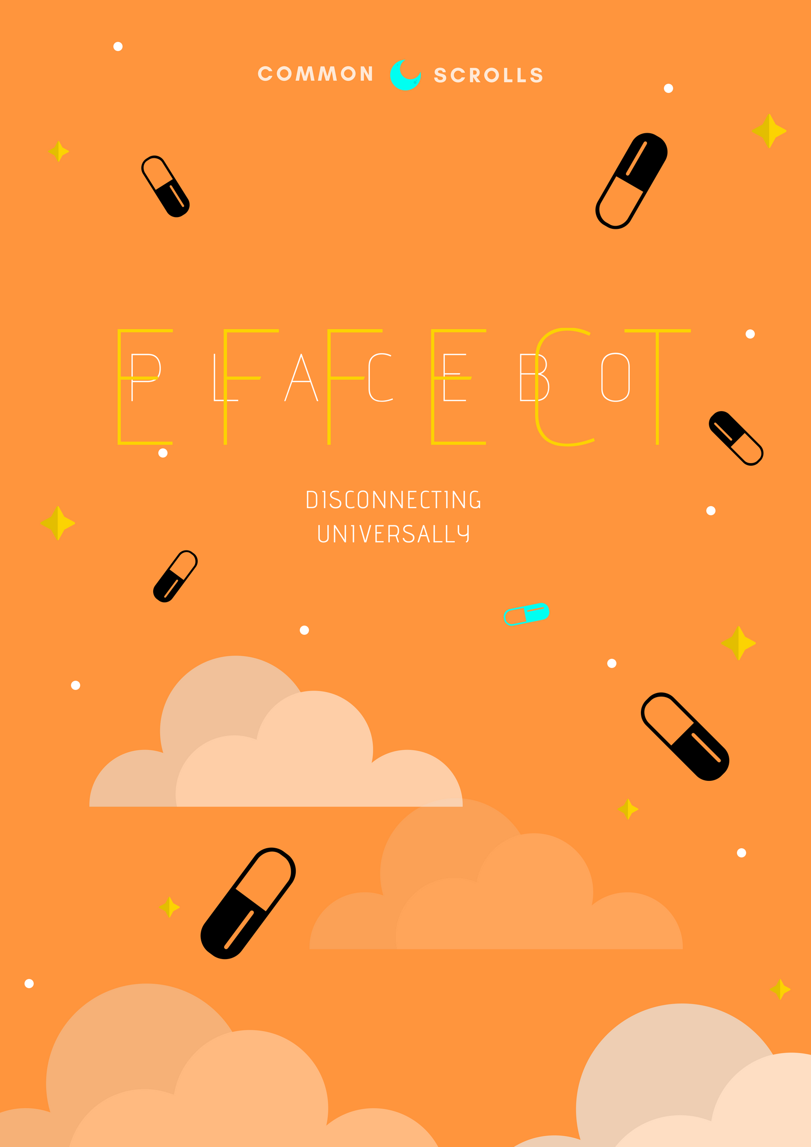
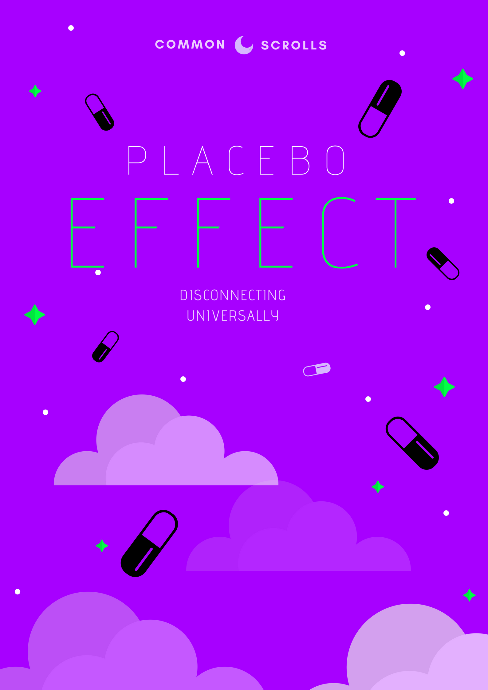
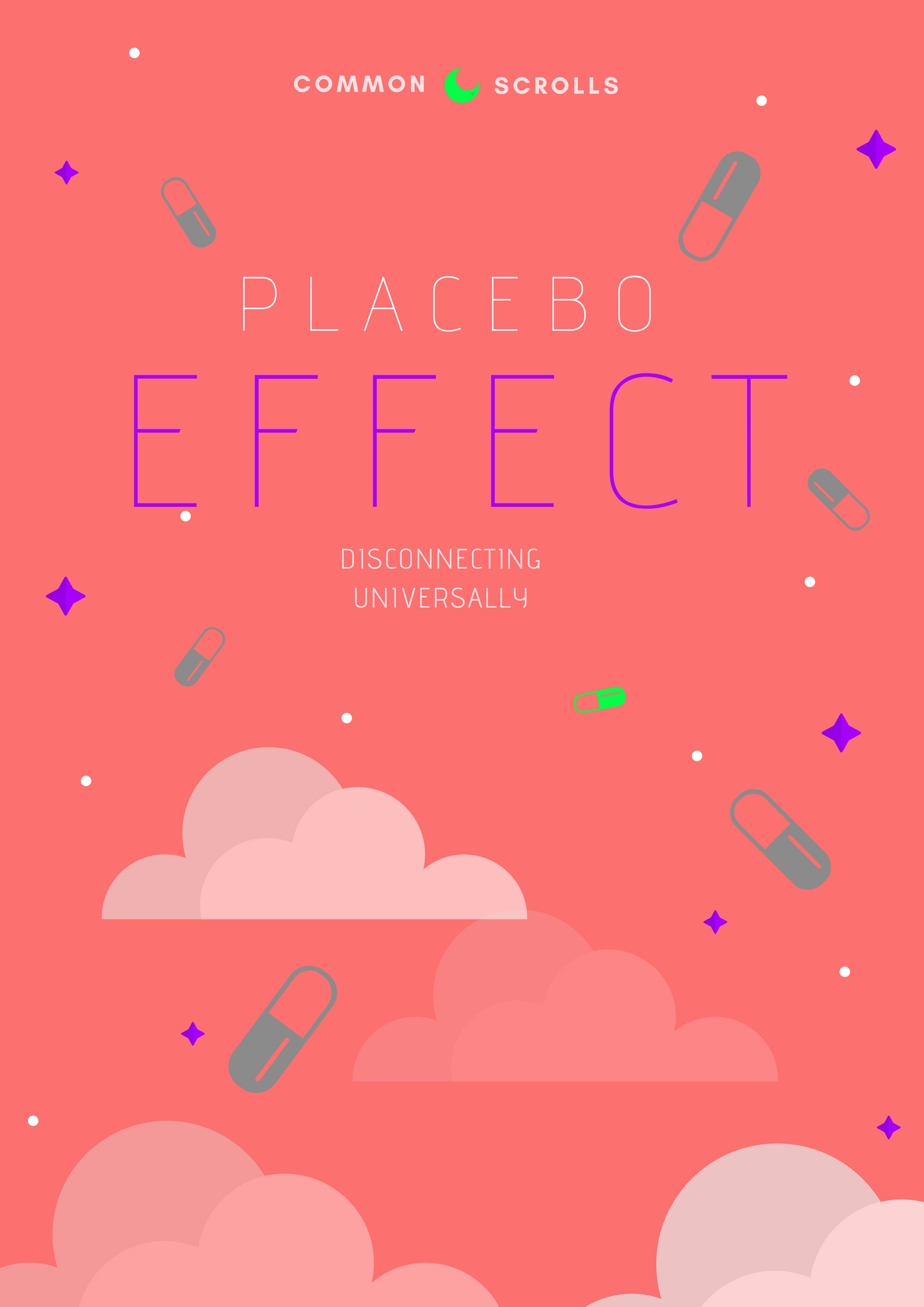
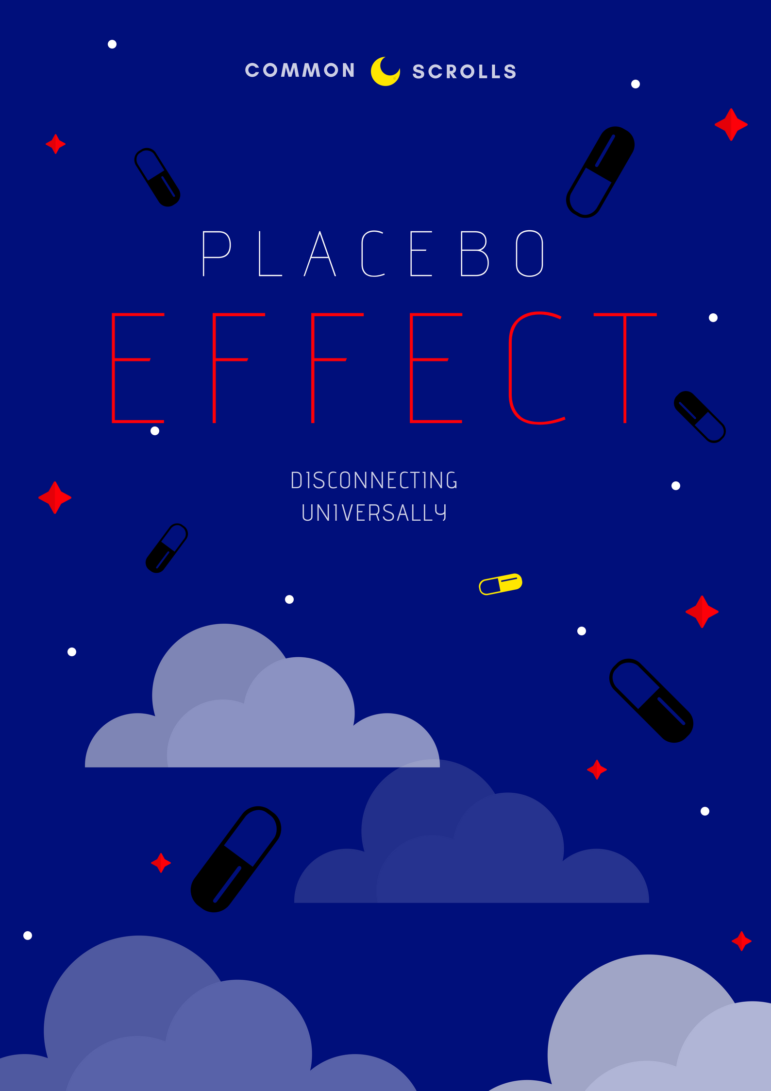
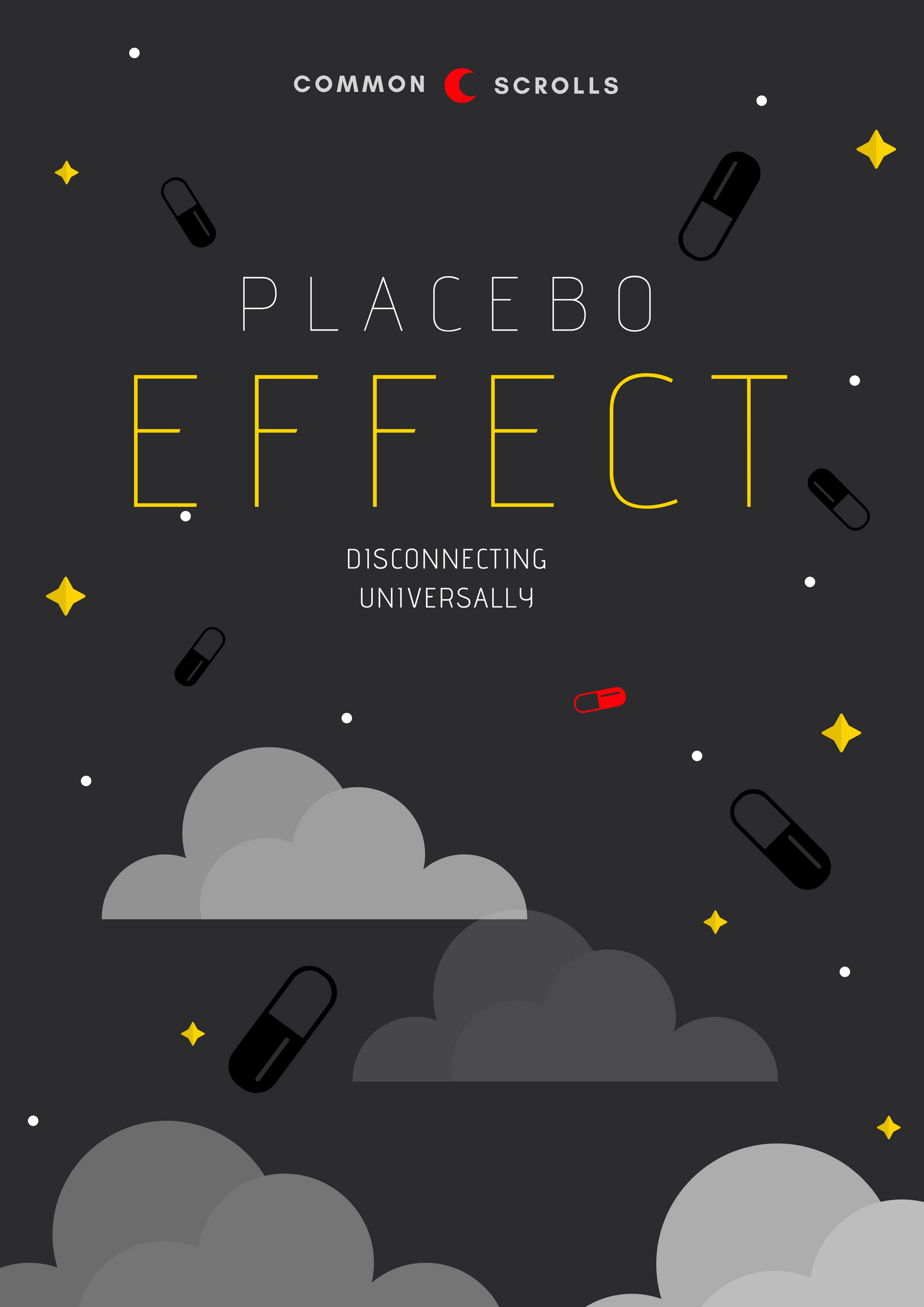
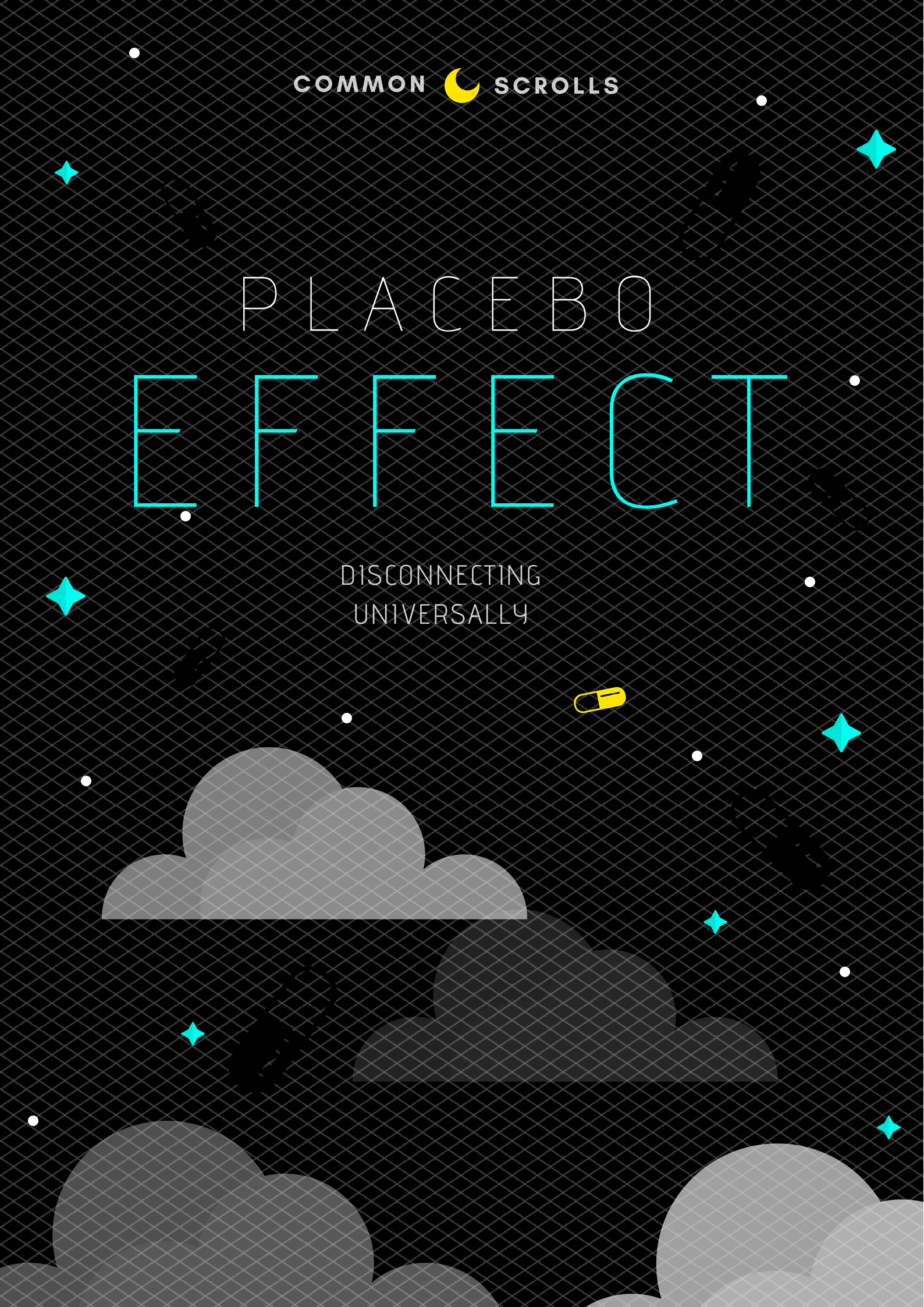
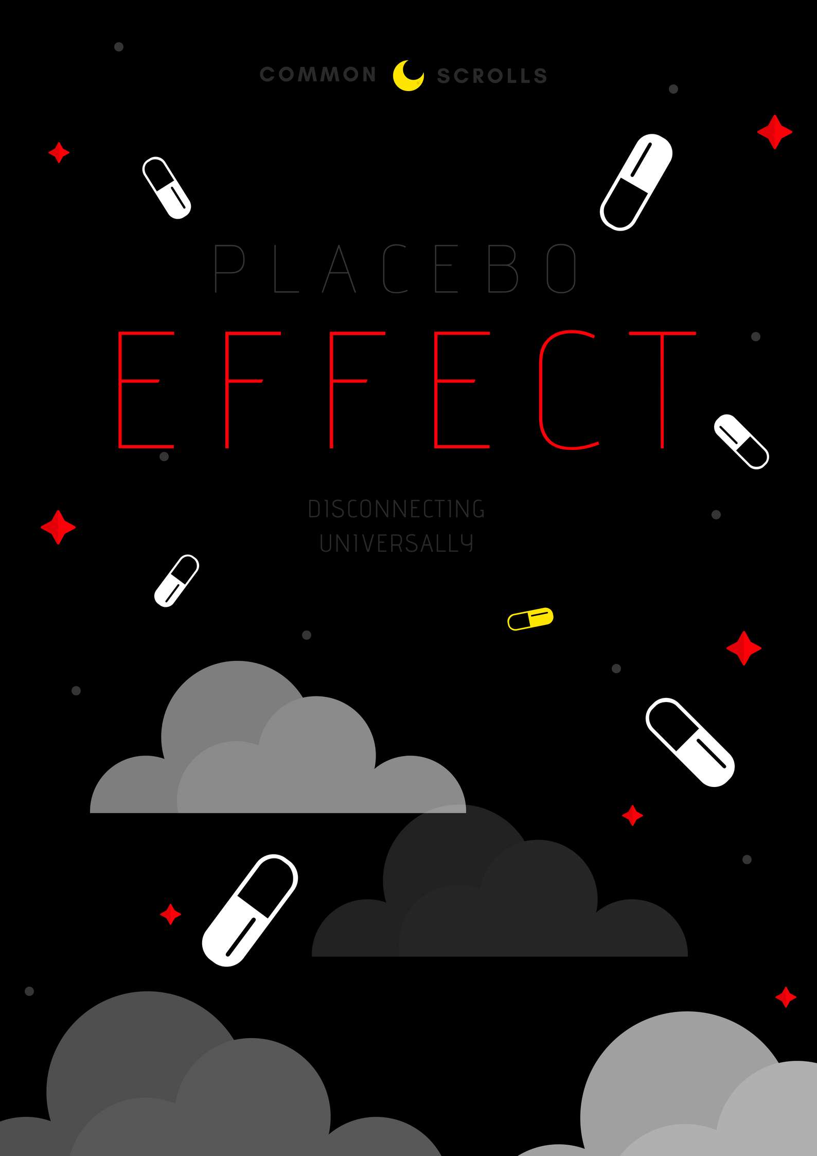
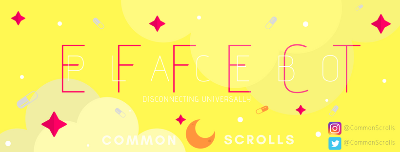
Every piece of visual work on this page started from that same unease. What does it feel like to exist entirely online and sense that something is missing that you cannot name? That feeling of walking into every room and forgetting what you wanted in there. The feeling of cooking a recipe and each time forgetting an ingredient, eventually forgetting why you went to the kitchen, or whether you made the meal at all. The cover art works through that question in colour. Multiple palettes, each one shifting the feeling: claustrophobic, electric, weightless, too-bright. Orange and yellow landed as the final direction. Warm enough to look like freedom. Wrong enough to feel like a screen.
The alias came next. I needed a name that could carry the project without attaching to my own. Common Scrolls came from the logic of the genre. In fiction, games, and film, the common scroll always marks the beginning. It holds the lore, starts the chain. It seemed right for a story about what happens when you try to read something outside the system you were born into.
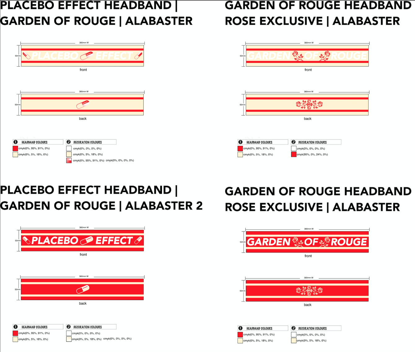
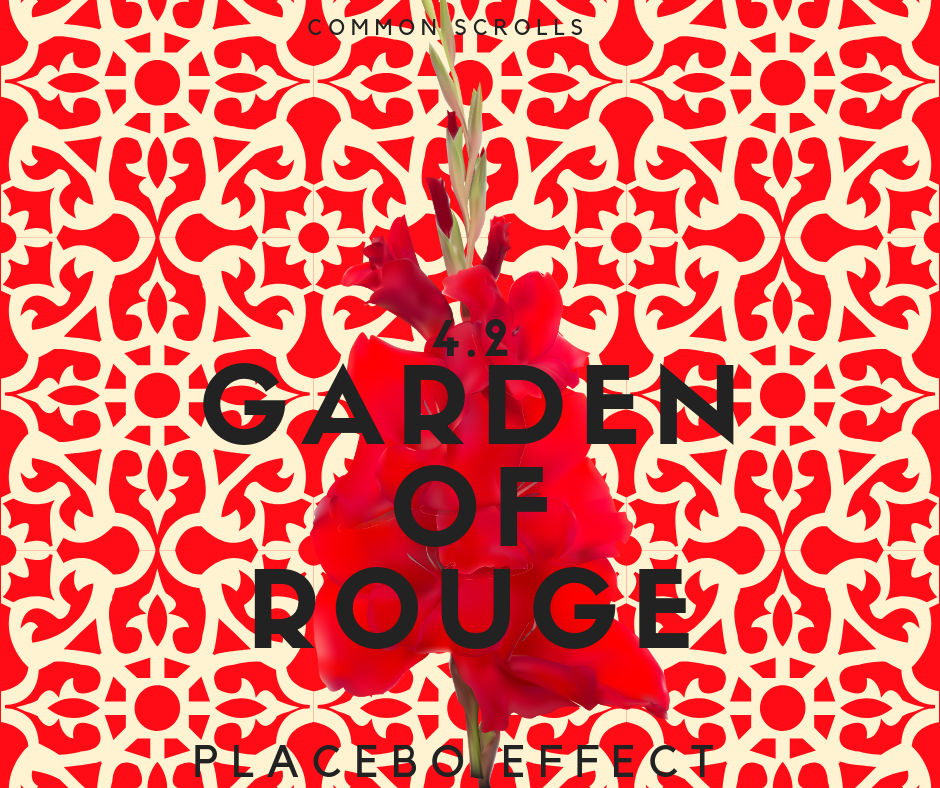
The brand extended into the chapters themselves. Garden of Rouge 4.2 is one of the most recent entries and it demanded its own visual language, pulling colour and motif directly from the text. The work and the writing are the same project.
Cover Art
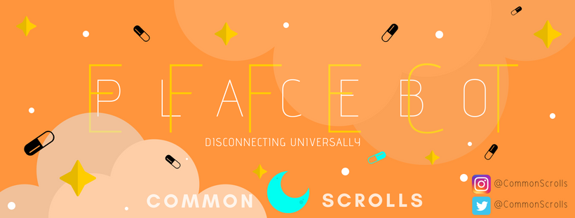
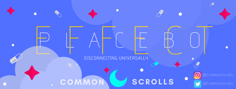
Social Media
The brand extended into the chapters themselves. Garden of Rouge, 4.2 — one of the most recent entries — demanded its own visual language, pulling colour and motif directly from the text.
Chapter Art
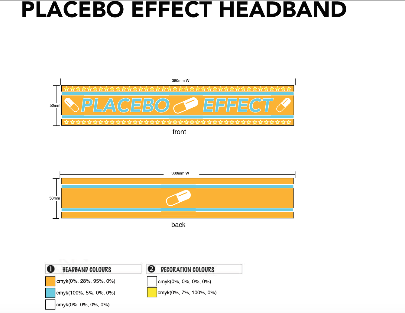
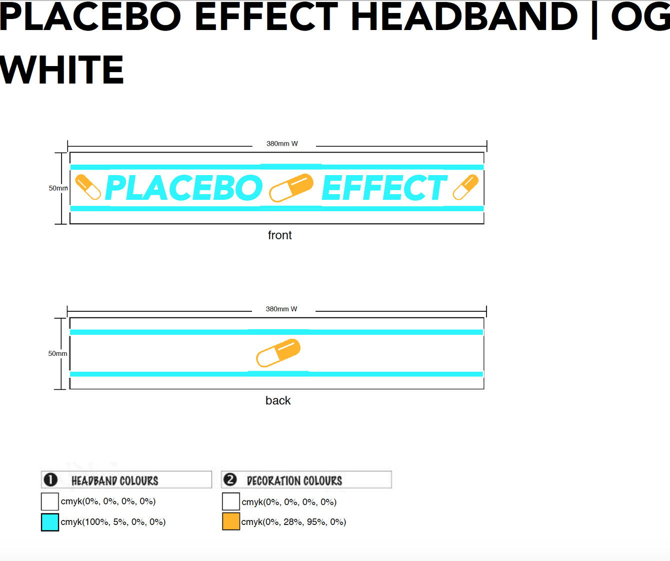
Merchandise